Absolutely. Start from text, PDFs, or shared links — or import content from existing decks — and Chronicle will restructure, rewrite, and redesign into a clearer, more compelling presentation with improved visual hierarchy and readability.

Why Chronicle is Better
-
Time-efficient creation – Build complete decks in minutes, not hours.
-
Designed for storytelling – AI structures your narrative automatically.
-
Cloud-based collaboration – Edit, comment, and present anywhere.
-
Beautiful by default – Polished visuals and layouts built in.
-
Integrated with work tools – Paste text, PDFs, or links and Chronicle transforms them into slides instantly.
Chronicle vs PowerPoint
While PowerPoint has long been the default for presentations, it was built for a different era — one of manual slides, static templates, and offline edits. Chronicle reimagines the process entirely. It uses AI to write, design, and structure your story automatically, combining modern design with collaboration and speed.
Where PowerPoint demands time and formatting, Chronicle gives you flow, clarity, and beautifully finished slides — in minutes, not hours.
Feature
Chronicle
PowerPoint
Creation Speed
Instant AI slide generation
Manual slide creation
Design Quality
Auto-designed, brand-consistent
Template-heavy, static
Collaboration
Real-time cloud collaboration
Limited offline sharing
Storytelling Support
AI-structured narratives
Manual content flow
Visual Dynamics
Interactive, cinematic layouts
Static transitions
Accessibility
Browser-based, team-friendly
Desktop-dependent
1. Chronicle (Best for AI-powered storytelling)
If PowerPoint taught the world how to make slides, Chronicle is teaching the world how to tell stories. Designed for founders, marketers, and product teams, Chronicle replaces templates with intelligence. Instead of starting from a blank slide, you can paste text, drop in a link, or upload a doc — and Chronicle instantly structures it into a cohesive, beautifully designed narrative.
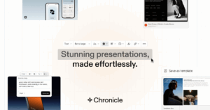
During testing, Chronicle felt less like presentation software and more like a creative partner. The AI writing engine helps you frame your message, refine your structure, and keep your content visually balanced. You can even turn meeting notes, product specs, or research PDFs into client-ready decks in minutes.
Chronicle is entirely cloud-based, meaning collaboration is seamless. Teams can co-edit, comment, and iterate together — no more version control chaos or missing fonts. It’s the tool modern teams reach for when they need to move fast and look world-class.
Pros
-
Instantly transforms text, docs, or links into polished, on-brand slides.
-
AI story structuring that organizes content into a clear beginning, middle, and end.
-
Beautiful by default: auto-layout, spacing, and visual hierarchy handled for you.
-
Real-time collaboration with comments, versioning, and shared links.
-
Brand kits (logo, fonts, colors) applied consistently across every slide.
-
Strong for product demos, roadmaps, research summaries, and investor narratives.
-
Web-based sharing with interactive viewing and quick exporting.
Cons
-
Browser-first: limited offline use compared to desktop tools.
-
Heavy custom motion graphics still better done in dedicated tools.
-
Learning mindset shift: write first, design second (AI handles layout)
Best for teams that care about clarity, speed, and storytelling.
2. Prezi (Best for cinematic movement)
Prezi replaces linear slides with a zoomable canvas that pans between ideas, creating a cinematic feel. This non-linear approach is great for concept maps, workshops, and storytelling where you want to dive in and out of themes. Presenters who master pacing and motion can deliver memorable “wow” moments—especially in classrooms, conferences, and vision pitches. If you’re moving beyond bullet points into spatial storytelling, Prezi is a strong fit.
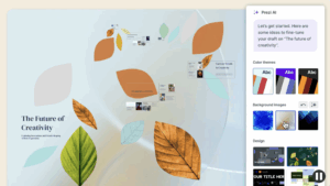
I tested Prezi by building a conference presentation on “AI and the Future of Design.” Within minutes, the tool mapped my sections visually across a large canvas. Instead of clicking “next,” I zoomed into each section like a guided tour. The result felt fluid, almost cinematic.
Prezi’s biggest strength is its zoom storytelling. You can literally show relationships between ideas — zooming in for detail, zooming out for perspective. But that freedom comes with a learning curve. It’s not drag-and-drop simplicity; you’ll need to invest some time to get used to the motion logic.
Pros
-
Zoom-and-pan narrative that makes relationships between ideas tangible.
-
Memorable motion for workshops, classrooms, and big-picture pitches.
-
Prezi Video overlays content on your webcam feed for engaging virtual talks.
-
Template themes help maintain visual coherence across complex canvases.
-
Cloud-based sharing with interactive viewing options.
Cons
-
Steeper learning curve than slide-based tools; motion can overwhelm if misused.
-
Precision formatting is trickier than in traditional slide editors.
-
Exports and offline workflows are more limited than desktop apps.
-
Audience accessibility considerations (motion sensitivity) require care.
-
Collaboration is improving but not as frictionless as Google-style editors.
Best for dynamic storytellers who want motion and surprise over structure.
3. Canva (Best for visual designers)
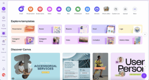
Canva has become the world’s default design playground — and for good reason. It’s easy, collaborative, and beautiful. For presentations, Canva offers thousands of polished templates spanning everything from startup pitches to classroom projects.
Creating a deck feels fast and creative: drag images, drop text, tweak layouts — done. You can embed videos, record presentations, or even use AI tools like Magic Write to fill in your copy. In testing, I found Canva ideal for visually driven marketers and teams who want everything to feel branded without hiring a designer.
Its biggest strength is flexibility. Beyond slides, you can design posters, social graphics, and reports — all from one workspace. But because Canva isn’t slide-first software, it can feel generic when you need advanced interactivity or storytelling flow.
Pros
-
Huge library of templates, photos, icons, videos, and brand kits.
-
Friendly drag-and-drop editor that’s quick for non-designers.
-
Great for multi-format output beyond slides (social, print, video).
-
Real-time collaboration and commenting built in.
-
Easy brand governance: lock colors, fonts, and logo usage.
Cons
-
Template abundance can lead to decision fatigue and mismatched styles.
-
Narrative structure and AI story guidance are limited vs AI-first tools.
-
Complex data visualizations and interaction are basic.
-
Heavy decks can require manual fine-tuning for consistency.
-
Best templates and assets often sit behind paid tiers.
Best for marketing, branding, and social media rich presentations.
4. Beautiful.ai (Best for AI-assisted layouts)
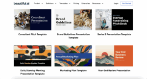
Beautiful.ai focuses on “smart slides” that auto-arrange content as you type, keeping alignment, spacing, and typography tidy. It’s ideal for business teams who want clean, consistent slides fast—status updates, board briefings, quarterly business reviews—without diving deep into design minutiae. Think of it as a “layout autopilot” that guards against messy slides.
The trade-off? Less creative control. You can’t deviate much from the design framework, which may frustrate advanced designers. But for business users who value polish and speed over customisation, Beautiful.ai is a potential option.
Pros
-
Smart templates that auto-format content, charts, and lists.
-
Consistent, professional look with minimal effort.
-
Simple interface tailored to business reporting and updates.
-
Useful built-in charts and infographic-style modules.
-
Great time-saver for recurring executive and ops decks.
Cons
-
Less freedom for bespoke or highly creative layouts.
-
Narrative support is structural, not story-coaching.
-
Animations/interactivity are comparatively basic.
-
Heavier customization can feel constrained by template rules.
-
Some advanced features require paid plans.
5. Mentimeter (Best for audience interaction)
Mentimeter is built for engagement: live polls, quizzes, word clouds, rankings, and Q&A embedded into your presentation. It shines in workshops, trainings, town halls, and classrooms where real-time feedback matters more than ornate design. If your goal is participation, not just presentation, Mentimeter is a strong companion tool—often used alongside a primary deck.
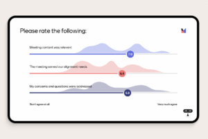
But Mentimeter isn’t about design — it’s about audience polling and interaction. You’ll still need another tool like Chronicle or Canva for your storytelling deck. Use Mentimeter when engagement matters more than aesthetics.
Pros
-
Frictionless polls, quizzes, scales, and Q&A for live sessions.
-
Audience joins via code; results appear instantly on screen.
-
Great for hybrid/remote events and active learning.
-
Simple templates for facilitation-first sessions.
-
Data export and response summaries for follow-up.
Cons
-
Limited narrative control; better as an interactive layer than a full deck tool.
-
Visual design options are basic vs design-led platforms.
-
Requires stable connectivity; offline mode is limited.
-
Not suited for dense storytelling or investor narratives.
-
Usually complements—rather than replaces—your main presentation app.
6. Keynote (Best for Apple Users)
When I first opened Keynote, I expected a cleaner, lighter version of PowerPoint — functional, familiar, maybe with a bit of Apple flair. But it’s far more than that. Keynote delivers the elegance and smoothness that only Apple seems to get right. It feels fast, fluid, and beautifully engineered — every transition, every animation, every drag-and-drop action feels effortless.
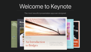
And if you’re part of the Apple ecosystem, Keynote really shines. During testing, I built a deck on my MacBook, edited it on an iPad Pro using Apple Pencil, and presented it later from my iPhone — all without exporting or emailing a single file. The iCloud sync was instant and flawless. Collaboration is also smoother than expected: multiple team members can edit live, leave comments, and preview changes.
That said, Keynote does have limitations. It’s very much an Apple-first tool — meaning it’s not available natively for Windows users, and exporting to PowerPoint can occasionally break advanced animations. The design asset library also feels sparse compared to visual-first tools like Canva or Chronicle. And while the offline-first model is great for solo creators, it lacks the fluid real-time collaboration that cloud-native tools now make standard.
Key Features
-
Cinematic effects: 30+ professional transitions and motion effects (fade, scale, rotate, zoom).
-
Animated charts: Build interactive data visuals that move dynamically across slides.
-
Cross-device editing: Sync across iPhone, iPad, and Mac via iCloud.
-
Real-time collaboration: Invite collaborators and edit together live.
-
Professional templates: 30+ clean, modern templates fully customisable for brand use.
-
PowerPoint compatibility: Open, edit, and export PPTX files for easy cross-platform use.
-
Apple Pencil support: Sketch, annotate, or illustrate directly on slides using your iPad.
-
Presenter tools: Use split-screen view to see notes and upcoming slides while presenting.
-
Offline editing: Build and edit presentations without an internet connection.
-
Multimedia integration: Drop in videos, audio, and interactive visuals effortlessly.
Pricing: Free on all Apple devices.
Pros
-
Sleek, minimalist interface that feels distinctly Apple.
-
Cinematic transitions and animations for storytelling and polish.
-
Seamless iCloud sync across devices — create once, access anywhere.
-
Easy PowerPoint export for cross-platform sharing.
-
Great balance between simplicity and professional output.
Cons
-
Only available on Apple devices (no native Windows version).
-
Limited built-in design assets compared to modern web tools.
-
Offline-first design limits collaborative speed for large teams.
Best for presenters who value design, motion, and simplicity — and already live inside the Apple ecosystem.
Why Chronicle Stands Out
Most presentation tools start with a template and ask you to make it fit. Chronicle flips that workflow. You start with ideas — a brief, an outline, a doc, a link — and Chronicle’s AI writes, designs, and structures the narrative for you. The result is a deck that feels intentional from the first slide to the last: clear logic, consistent visuals, and a story that lands.
Where traditional software demands time-consuming formatting, Chronicle gives you flow. It doesn’t just hand you slides — it gives you the story behind them, already laid out with on-brand typography, spacing, and visual hierarchy. Edit the words, swap an example, add a chart; the design intelligence keeps everything polished.
FAQs
PowerPoint is template-first and manual by design. Chronicle adds AI-assisted slide generation, auto-design, and story structuring, so you move from rough notes to a cohesive, on-brand deck in minutes — without wrestling with masters and alignment.
It merges AI creativity, real-time collaboration, and professional design into a single workflow. Chronicle helps you craft the narrative, applies your brand automatically, and keeps slides visually consistent as your content evolves.
Yes. Chronicle adapts every slide to your tone, purpose, and visual brand. Update messaging, swap layouts, or add sections — the design system reflows content so the deck stays tidy and on-brand.