

A strong visual presentation does more than make your slides look good — it makes your message easier to understand, remember, and act on. In a world where attention spans are shrinking and information density is rising, visual-first presentations help audiences process ideas faster and with far less cognitive load.
This guide covers the core elements of visual presentations, the main types of visual presentations, practical visual storytelling techniques, and design principles that make any presentation more visually appealing. Whether you’re preparing a sales deck, investor pitch, internal update, or classroom lesson, these visual presentation techniques will help you craft work that’s clear, compelling, and memorable.

Mayuresh
CEO of Chronicle

Core Elements of a Strong Visual Presentation
1. Layout Fundamentals
A clean, well-structured layout is the foundation of any effective visual presentation. Good layouts:
-
Create predictable patterns so audiences know where to look
-
Group related information visually
-
Reduce noise and force clarity
-
Support logical flow rather than compete with it

Use grids, alignment, and consistent spacing to anchor your content. A strong layout is invisible — the audience never notices the structure, only the clarity it creates.
2. Contrast, Color Balance & Typography
Color, contrast, and typography work together to guide attention and improve readability.
-
Contrast: Use high contrast between background and text, and apply contrast to emphasize priority (e.g., bold headlines, lighter body text).
-
Color balance: Limit your palette to 2–3 core colors. Let color signal meaning — not decoration.
-
Typography: Choose clean, legible fonts. Use typographic scale (H1 → H2 → body) to show hierarchy.
These presentation design principles help ensure visual consistency and professional polish.
3. Visual Hierarchy in Presentations
Visual hierarchy tells the audience what matters most. It’s one of the most important presentation design principles.
Ways to create hierarchy:
-
Size (large → important)
-
Weight (bold → priority)
-
Position (top-left → first to notice)
-
Color (accent → action)
-
Spacing (breathing room → importance)
If your slide looks “busy,” it’s usually a hierarchy problem.
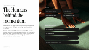
4. Image Quality & Relevance
Images anchor emotion and speed up comprehension — but only when used intentionally:
-
Use high-resolution images
-
Avoid stock photos that feel staged
-
Pick visuals that explain, not just decorate
-
Use consistent style (tonality, photography type, cropping)
If an image doesn’t add information or feeling, remove it.
5. Icons vs Photos vs Illustrations
Use each format with purpose:
-
Icons → simple ideas, labels, categories, steps
-
Photos → emotion, real-world context, credibility
-
Illustrations → abstract ideas, processes, metaphors
Mixing too many styles creates noise. Choose one dominant style and let the others support it sparingly.
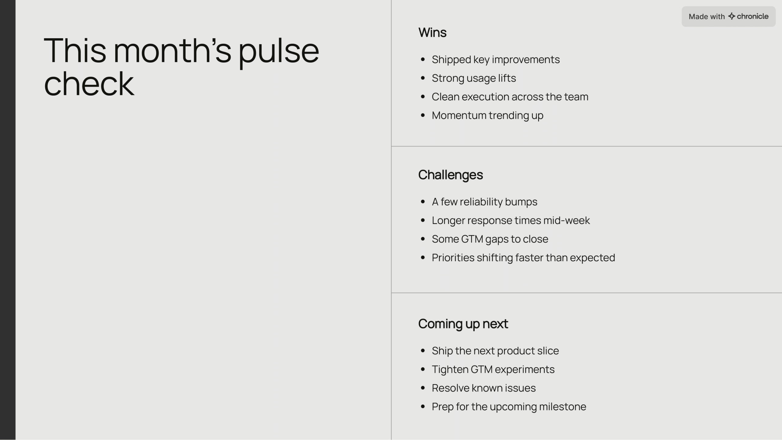
Types of Visual Presentations
1. Slideshows
The most common form of visual presentation — ideal for storytelling, project updates, pitches, and lessons. Their modular nature allows a smooth narrative with progressive reveals.


2. Infographics
Best for condensing complex information into a clear, visual flow. Timelines, workflows, maps, and comparisons all benefit from infographic formats.

3. Video-Based Presentations
Videos are powerful for onboarding, marketing, demos, and education. They combine motion, narration, and visual hierarchy for deep engagement.
4. Charts & Graphs
Quantitative stories require visual clarity:
-
Line charts → trends
-
Bar charts → comparisons
-
Scatter plots → relationships
-
Pie charts → only when simple and limited
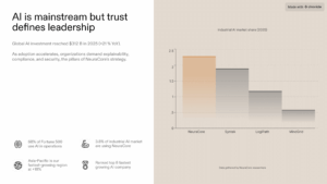
The goal is not just to show numbers, but to make the audience feel the meaning behind them.
5. Interactive Presentations
Ideal for product demos, training, workshops, and immersive storytelling. Interactivity encourages exploration and deeper engagement.
6. Poster-Style or One-Pager Presentations
These condense the entire message onto one page. Successful one-pagers rely heavily on layout, hierarchy, and clean design.
Visual Storytelling Techniques
1. Turning Data Into Narrative
Data only becomes meaningful when paired with interpretation.
Good data storytelling answers:
-
What changed?
-
Why does it matter?
-
What should we do next?
Pair charts with clear headlines that state the takeaway, not the data itself.
2. Visual Metaphors
Metaphors instantly translate complex ideas into something familiar. Examples:
-
Funnels for conversion
-
Mountains for progress
-
Bridges for transitions
-
Maps for strategizing
Metaphors help audiences develop mental models quickly.
3. Before/After Comparisons
One of the strongest visual presentation techniques. “Before → After” slides help illustrate:
-
Tool improvements
-
Workflow changes
-
Business impact
-
UX redesigns
-
Strategic outcomes
The contrast creates clarity.
4. Case-Study Visuals
Use diagrams, story structures, and visuals to show:
Problem → Approach → Result
This simplifies complex projects into digestible, visual flows.

Practical Steps to Create a Visual Presentation
These steps will help you learn how to make presentations visually appealing — even without a design background.
1. Know Your Audience & Purpose
Your visuals should shift depending on:
-
Executive audiences → clarity, summaries, focus
-
Technical audiences → diagrams, precision
-
Sales audiences → outcomes, benefits
-
Students → simple visuals, repetition
Purpose dictates visuals.
2. Choose a Visual Structure or Template
Starting with a high-quality template eliminates 80% of design mistakes. Look for ones with:
-
Consistent spacing
-
Strong hierarchy
-
Clean layouts
-
Thoughtful typography
3. Apply Presentation Design Principles
This includes:
-
Contrast (light vs dark, bold vs normal)
-
Spacing (whitespace is your best design tool)
-
Hierarchy (prioritize your message)
-
Alignment (everything should snap into place)
These improve professionalism instantly.
4. Add Visuals Intentionally
Use:
-
Icons to support lists
-
Photos to show context or emotion
-
Charts to explain data
-
Diagrams to show relationships
-
GIFs or motion for emphasis (sparingly)

Every visual must earn its place.
5. Maintain Consistency
Inconsistent handwriting visually communicates disorganization. Ensure:
-
One color system
-
One icon style
-
One photography style
-
One grid
-
One type system
Consistency = trust.
6. Add Interactivity (Where Useful)
Examples:
-
Layered diagrams
-
Hover reveals
-
Clickable journeys
-
Annotated visuals
Interactivity increases comprehension when used to reveal complexity, not hide it.
7. Test Clarity & Accessibility
Ask:
-
Is the hierarchy obvious?
-
Can someone skim this in 3 seconds?
-
Is text readable on any device?
-
Is color contrast accessible?
Show your deck to someone unfamiliar with the topic — if they “get it,” your design works.
Why Choose Chronicle for Visual Presentations
If you’re tired of fighting with rigid slide tools or losing hours to design tweaks, Chronicle gives you a faster, more expressive way to create beautiful, visual-first presentations.
AI That Builds Beautiful Slides Automatically
Paste text, import a PDF, or share a link — Chronicle transforms content into structured, visually appealing slides instantly.
A Smart, Free-Form Canvas
You’re not trapped in static layouts. Chronicle lets you place, resize, and design elements freely — without breaking alignment or spacing.
Motion-Ready Widgets
Use dynamic widgets like Peek, Swap, or Deep Hover to guide attention and build interactive storytelling moments.
Polished Design by Default
Typography, hierarchy, contrast, and spacing come built-in — no design background required.
Real-Time Collaboration for Teams
Work with marketers, product managers, founders, and designers simultaneously — without version chaos.
Common Visual Mistakes & How to Fix Them
Visual Presentations FAQs
Visuals increase comprehension, reduce cognitive load, guide attention, and make stories more memorable. They turn abstract ideas into something your audience can see.
Use hierarchy, clean layouts, high-quality images, consistent design, and storytelling visuals like diagrams, comparisons, and case-study flows.
Charts, diagrams, infographics, annotated visuals, and high-quality photography are best for professional, data-heavy, or executive presentations.
Use size, weight, color, spacing, and position to show priority. Make the most important message the most visually dominant element.
Chronicle, Canva, Figma Slides, Keynote, and Google Slides. Chronicle stands out for AI-driven visual design, interactive widgets, and a free-form canvas that produces polished layouts automatically.